
Zebulon
Overview:
I was asked to conduct a hypothetical rebrand of Zebulon, a hub for live entertainment located in the Frogtown neighborhood of Los Angeles. It is owned by two French brothers, who originally established this “café-concert” space in Brooklyn. Since opening its doors in L.A., this local business has gained the reputation of being a hip venue for live music, film screenings, and foreign language meetups.
Deliverables:
Brand Identity + Strategy, Motion Design, Print Design, UX / UI Design
Motion Design | Logo Animation
Following the process of researching the history of the brand, my goal was to develop a visual identity system that reflects the edgy, refined, and magnetic allure of Zebulon. The first step in this endeavor was to create a brand new logo. In order to abide by my desire for simplicity and modernism, I integrated geometric forms to illustrate the letter “Z.”
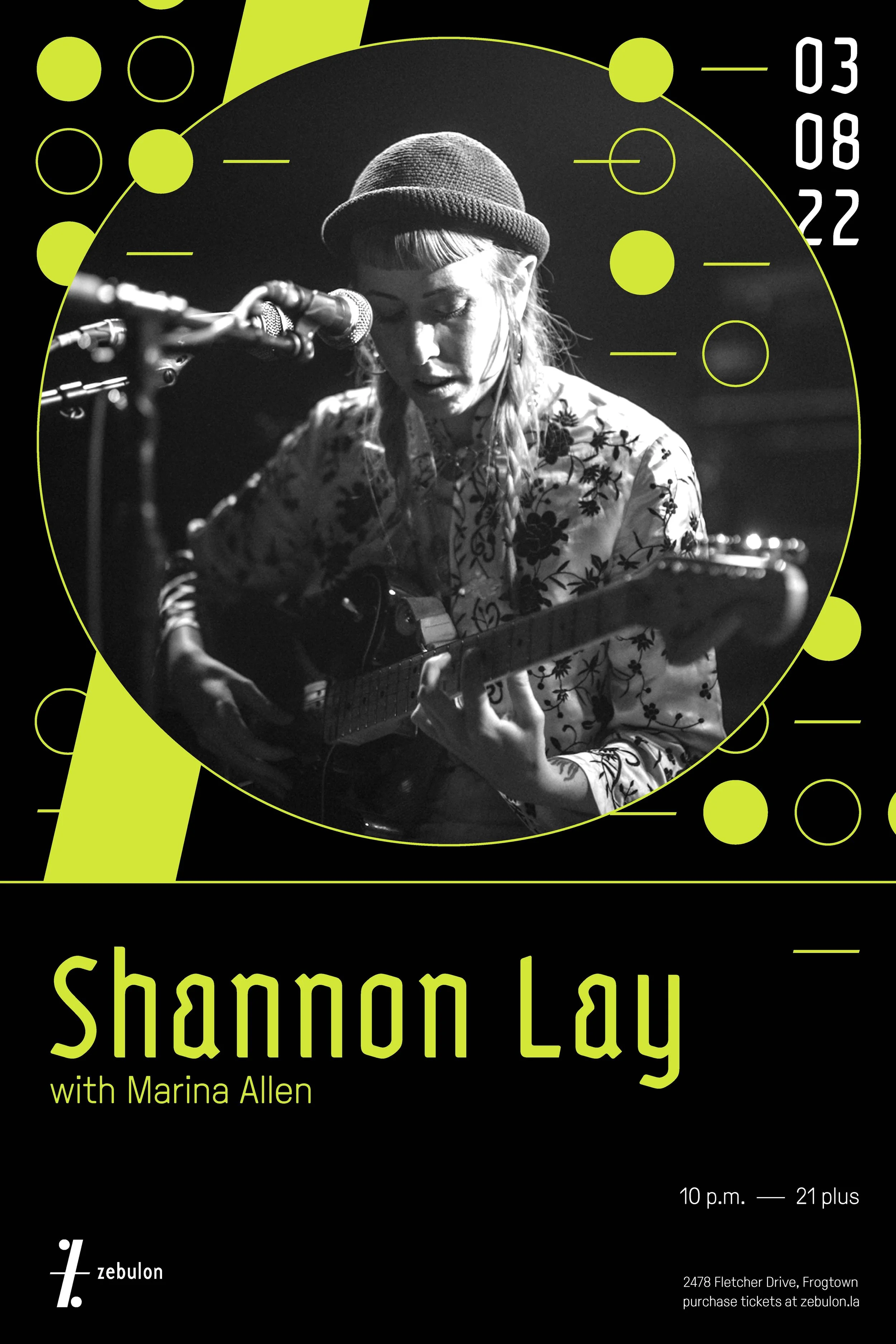


Print Design | Promotional Poster Series
One pivotal learning outcome of this rebrand was to envision the ways in which a logo can inform the graphic language of a brand. In this poster series, we observe how I began to separate the circles, diagonal rectangle, and horizontal dash of the “Z” logo to create energetic abstract patterns.


Print Design | Concert Tickets, Event Invite, Food + Drink Menu
Although live music is the primary focal point at Zebulon, cultural events such as film screenings serve to broaden its customer base, while the design of food and drink menus were created for foodies like me.


UX / UI Design | Website Landing Page, Instagram Story
Although I am a die-hard lover of print design, the creation of digital applications such as a landing page and social media story are essential; currently, that is the primary way in which visitors become aware of various event offerings.


Merchandise Design | Tee and Tote Bag, Front + Back
In creating numerous merchandise products, I was able to come full circle, and pay homage to the brand’s bicoastal history.
Overall, this project enabled me to develop a graphic system that is minimalist in form, yet maximalist in behavior. Creating this visual identity provided me with experience in conducting a rebrand for a small, local business in the realm of hospitality, which I thoroughly enjoyed.
